

Survey website
Engaging students with an animated seagull experience designed to reduce survey fatigue and make student feedback feel more approachable, guided, and entertaining.


The situation
The University of Sussex Student Experience Team used surveys to understand student life and improve campus experience. However, traditional survey distribution methods were seeing declining response rates, making it harder to collect meaningful and representative feedback.
At the same time, a new cohort of students was about to arrive on campus. The team wanted not only to understand these students better, but also to help them settle into university life more quickly.

The challenge
Traditional survey distribution was failing to generate meaningful participation, making it difficult for the Student Experience Team to collect reliable insight into student satisfaction and campus life. At the same time, the team also needed a better way to help incoming students become familiar with the university environment.
Design challenge
How might we transform survey participation into a lightweight, engaging campus experience that could both increase response rates and support student onboarding?
The Proposal
From Survey to Story-Led Campus Journey
We transformed a low-engagement survey into a branching campus journey led by Bramber the seagull.
Scan & watch
Students scanned QR codes at each stop to unlock a short mobile animation.
Choose & branch
Their answers shaped the next location and triggered different story moments.
Explore & collect
The journey guided students through key campus spaces and ended with a welcome gift reward.

The design process
Step 1:


Story flow
diagram
After the stakeholder workshop, we created a story flow diagram and an initial script to define the narrative structure and user journey, ensuring the experience aligned with the university’s goals. Based on the workshop findings, we identified the three key questions the university most wanted to explore and embedded them naturally into the journey.
Different responses at key moments triggered different narrative branches and guided participants to different campus locations. This turned the survey from a simple data-collection tool into a more exploratory and engaging onboarding experience.
Initial script draft
Story flow diagram
Step 2:
Character design
Inspired by Sussex’s most familiar campus animal, the seagull, we designed a character that felt both playful and immediately recognisable. Starting from campus reference and early visual exploration, we refined the design through two rounds of iteration until reaching a final version aligned with stakeholder expectations. We then developed a range of final expressions and poses to give the character more personality and support the tone of the overall experience.


Campus reference
Initial character design
Final character design


Step 3:
3D Design and
Animation
Building on the approved 2D character design, we developed the seagull into a 3D character while preserving its recognisable silhouette, expressions, and playful personality.
In parallel, we designed the environments based on real locations across the University of Sussex campus, grounding each scene in spaces students would genuinely encounter. The addition of animation helped bring the character and environments to life, making the experience feel more dynamic and engaging.


Animation by Bowen Tan
Step 4:
Web design and development
Lightweight deployment
Built on GitHub for quick publishing and long-term maintainability.
Flexible survey system
Google Forms made it easy for the university to update questions after handover without rebuilding the website.
User-centred flow
Students could either watch the animation or skip directly to the questionnaire, ensuring that feedback collection was never blocked by loading time or attention span.
Branching exploration
Different answers led students to different campus locations, unlocking new story moments and turning the survey into an interactive onboarding journey.

QR scan → Auto-play animation → Optional skip → Questionnaire → Personalised direction → Next story chapter

GitHub deployment and front-end structure

Google Forms response tracking


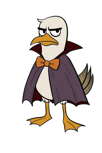
Halloween-themed character variations


Animated video teaser
Mobile pilot view – animation
Mobile pilot view – questionnaire
On-site testing poster


Step 5:
Pilot and user testing
Before the official rollout, we ran a small-scale user test to validate three things: whether students were willing to engage with the experience, whether the interaction flow felt intuitive to follow, and whether the combination of animation, questionnaire, and campus exploration was enjoyable in practice.
Because the pilot took place close to Halloween, we chose not to test the final version directly. Instead, we created a seasonal themed version that felt timely and approachable. This helped us assess not only the functionality of the system, but also whether thematic packaging could strengthen curiosity, participation, and overall engagement.
Step 6:
Feedback and Iteration
What worked
The pilot received strong positive feedback. Participants responded well to the playful, character-led video, and most users watched the animation through before completing the questionnaire. This suggested that the narrative format was successful in sustaining attention and encouraging participation.
What needed improvement
On-site observation and user feedback highlighted two issues. First, the video took up too much of the mobile screen, making the questionnaire button easy to miss unless users scrolled. Second, the poster did not create a strong enough visual link between the character and the QR code, which reduced its ability to attract spontaneous scans.


Step 7:
Second iteration
Improved mobile layout
To make the next step more visible, I reduced the video’s screen proportion and moved the “Go to Questionnaire” button higher on the page. This removed the need for scrolling and ensured that all essential content could be understood within a single mobile view.
Redesigned QR posters
I also redesigned the QR posters, pairing each code more clearly with its corresponding character. This made the scanning points more visually distinctive and helped attract more attention in the testing environment.
Before
After


Before
Redesigned poster
Actual effect
Final Outcome
Poster


Animation
Real-world use


Project recognition
After the project was completed, the university presented it publicly as a successful case study. This showed that the experience was not only well received during testing, but also recognised by stakeholders as a valuable and shareable outcome.
Reflection
One of the most valuable lessons from this project was understanding how much participation can be influenced by seemingly small design decisions. While the character, animation, and narrative created initial interest, it was the clarity of the interface and the visibility of the physical scan points that determined whether users would continue the journey.
Through testing and refinement, I learned to think about the experience more holistically — not as a series of isolated screens or assets, but as a connected journey across digital and physical touchpoints.